CullenLaw
APPELLATE LAW FIRM
Brand Messaging and Identity / Custom Photography / Website Design & Development

CullenLaw
OVERVIEW
The Cullen Law Firm (TCLF) came to us because their website was several years old and the look and feel no longer suited them. More than the aesthetics though, pivotal events had reshaped the firm's direction, and they wanted the new website to reflect their new direction.
TCLF’s founder, Paul Cullen Sr. had retired, and his son Paul Cullen Jr. had taken the lead as the managing partner. Legacy client caseloads were becoming a lighter lift, but this was good because the attorneys were ready to pursue a different goal of becoming the go-to appellate lawyers for bigger law firms and further defining their expertise by doing deep dive analysis into legal issues.
STARTING WITH THEIR NAME
One of the first things we suggested was streamlining the name. They were already using the domain address Cullenlaw.com so why not simplify the firm’s name to reflect a more simplified moniker? Acronyms are so 1990s and definitely not as SEO-friendly. We kept the firm’s legacy name underneath since it has meaning amongst CullenLaw colleagues and clients and as an homage to Paul’s Dad, a well-known, respected attorney in DC and throughout the US.
CUSTOM BRAND PHOTO SHOOT
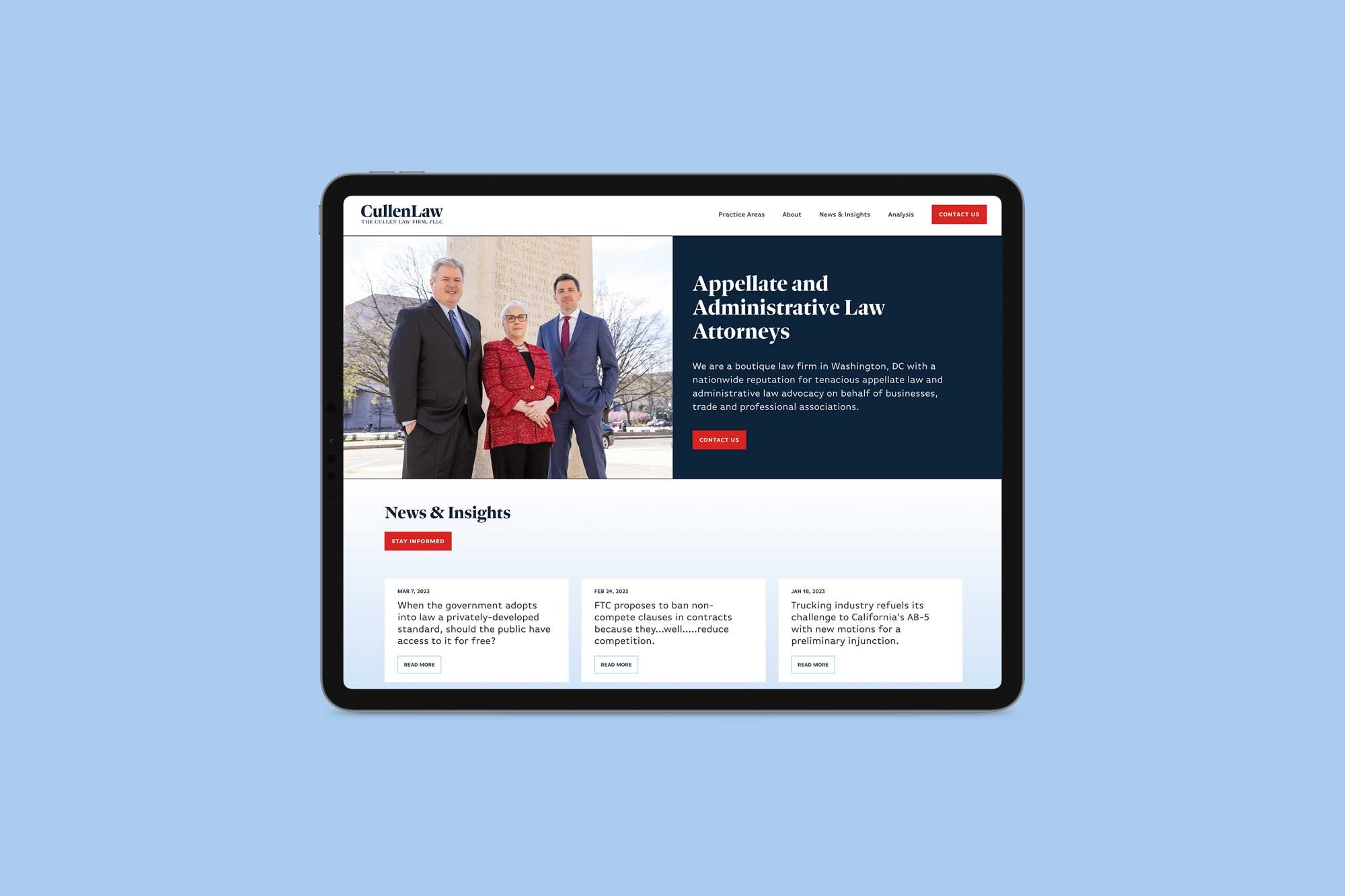
Using the intel we acquired during the Power Plan we began writing the website focusing on what makes CullenLaw different and drilling down into their expertise and tenaciousness. They were moving offices, so we scheduled the photoshoot quickly to take advantage of their current space. We also headed to the E. Barrett Prettyman District Courthouse on Constitution Ave. This courthouse is relevant to the type of cases CullenLaw niches in, and Paul thought it was an appropriate backdrop for some photos.
BLOG IMPORT, CONTENT WRITING & WEB BUILD
They had A LOT of evergreen content on their old site and we didn’t want to lose all that expertise so Emily spent a lot of time documenting the content, importing it and assigning the appropriate categories and tags and organizing it nicely on their new site. We also had our client work with our web content writer consultant, Monika Jansen to create engaging brand content.
The website brand colors were designed to coordinate with the blues and reds the partners had chosen to wear during the photoshoot and with the dark rich brown in their offices. The typography was chosen for its readability, professionalism and approachability.
We’re really proud of this project! Check out the site below!
Before & After
Move handle left (after) to right (before).
Before
After


